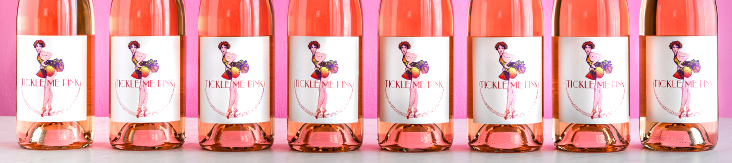
Tickle Me Pink is a bright and lighthearted wine blend, developed by Mollie Haycock, Scott Harvey, and Dr. Richard Peterson. Aiming to create an instantly classic, American-flavored blend, the trio leveraged their vast experience and launched a fun, nostalgic wine
What we did:
BRAND STORYTELLING
CUSTOM ILLUSTRATIONS
PRINT MANAGEMENT
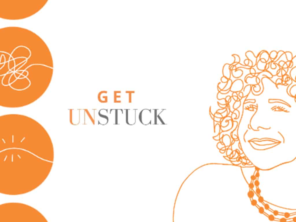
ALL ABOUT ATTITUDE
If your brand has a big personality, your website should, too. Because a website isn’t literally a walking, talking ambassador of your brand, but is expected to be the closest thing to it, every detail that greets a site viewer is important. The color, layout, fonts, decals, and copy work in tandem to share your brand message with the world.
Tickle Me Pink came to us with a clear understanding of their spunky brand personality, and a need for insights on how to translate that attitude into the digital space. We came up with a website design that is bright, vintage, and playful, just like the wine itself!
VISUAL STORYTELLING
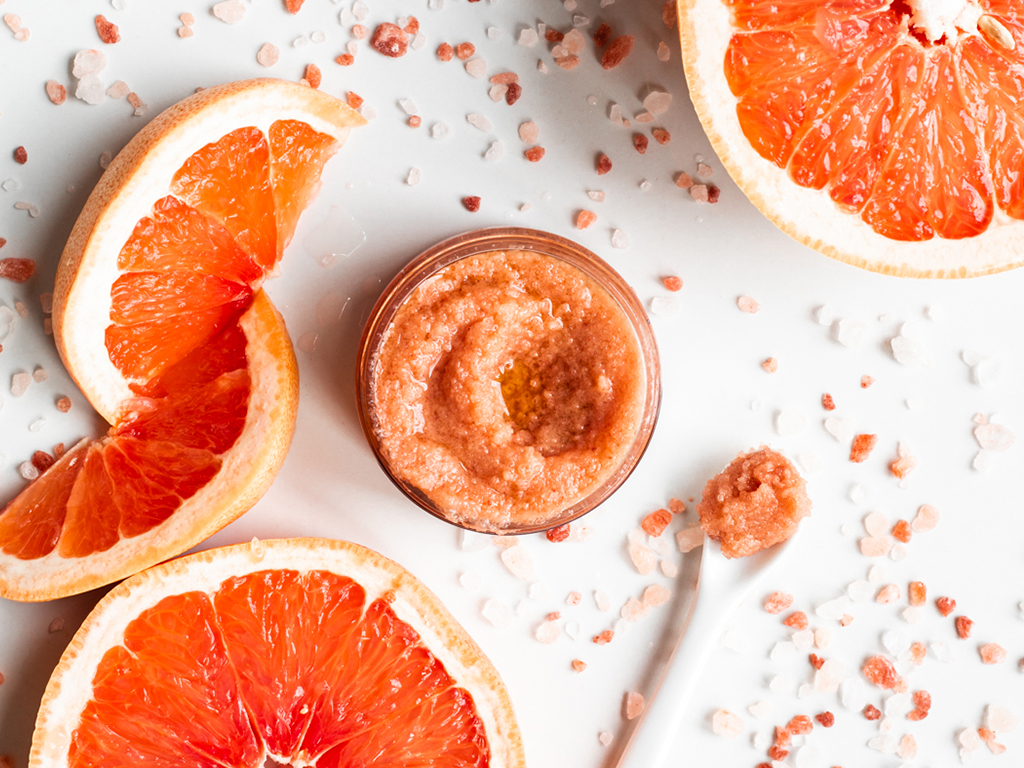
Product photography is often an afterthought—so much time is spent in market research, product development, or basic brand design that the final product is often thought to be automatically poised to speak for itself.
While cohesive branding does make it simple for a product to be a standalone storyteller, compelling product photography can dazzle and wow viewers, leading to deeper interest and reducing barriers to purchase.
Creating a plan for product photography is often an act of brand development—it’s an exploration of the moods and meaning of a product in its environment. Conceptualizing the ways that Tickle Me Pink is enjoyed, the flavors, colors, and memories that go into each bottle, and the emotional impact that its bright approach has on consumers, we developed clear visual stories.
Tickle Me Pink was developed with spunkiness and joy, and that lightheartedness has been infectious, wouldn’t you agree?
We are humbled to be a part of amazing projects like these!
Love what you see? Let us do it for you!
Book a call, we look forward to hearing about the great work you’re doing in your community.